Huemanテーマを追加CSSで改良
モバイル
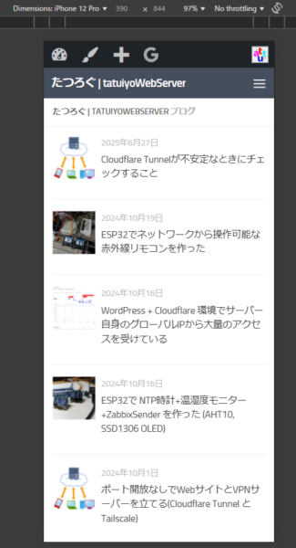
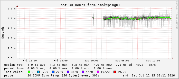
スマホで見たとき、トップページが微妙な感じなので以下のようにします。

before
after
/* スマホ画面(最大768px幅)にだけ適用 */
@media screen and (max-width: 768px) {

  /* 記事一覧の概要部分を非表示に */
  .entry-summary,
  .post-excerpt,
  .archive .entry-content {
    display: none !important;
  }

  /* タイトルのフォントサイズを小さくする */
  .entry-title,
  .post-title,
  .archive .entry-title {
    font-size: 1rem !important; /* 必要に応じてサイズを調整 */
	}

	/* カテゴリーを非表示にする */
  .cat-links,
  .entry-categories,
  .post-categories,
	.post-category,
  .archive .cat-links {
    display: none !important;
  }

	/* 画像のコメントマークを非表示にする */
	.post-comments {
    display: none !important;
  }

}
見出し
こんな感じになります
H2
H3
H4
/* H2見出し:吹き出し風(グラデーション) */
main h2.wp-block-heading {
  position: relative;
  border: none;
  background: #f0f8ff; /* 薄い水色の背景 */
  padding: 0.6em 1em;
  color: #333;
  line-height: 1.5;
  font-size: 20px;
}

main h2.wp-block-heading::before {
  content: '';
  position: absolute;
  top: 0;
  left: 0;
  width: 8px; /* 太めのアクセント */
  height: 100%;
  background: linear-gradient(180deg, #4facfe 0%, #00f2fe 100%);
  border-radius: 3px 0 0 3px; /* 少しだけ角を丸く */
}

/* H3見出し:H2をシンプルに */
main h3.wp-block-heading {
  position: relative;
  border: none;
  border-left: 6px solid #4facfe; /* 青色の単色線 */
  padding: 0.4em 1em;
  background: #f8f9fa; /* ややグレーがかった背景 */
  line-height: 1.4;
  font-size: 18px;
  color: #333;
}

/* H4見出し:さらにシンプルに */
main h4.wp-block-heading {
  position: relative;
  border: none;
  border-bottom: 2px solid #4facfe; /* 青色の下線 */
  padding: 0.3em 0;
  line-height: 1.4;
  font-size: 16px;
  color: #333;
}
画像添付後の余白調整
記事中に画像を追加した直後のブロックの余白がゼロで見づらいので追加します。
.wp-block-image {
  margin-bottom: 30px;
}


最近のコメント